Colour Collection - Cosmopolitan Chique
Pure & Original is a Dutch paint brand with a wide range of paints and colours made with respect for human and nature.
All our paint is coloured with 100% natural pigments and we always use a mineral base as much as possible. It’s not surprising that our most popular paint colours are neutrals. The Classico chalk-based paint and Fresco lime paint are often selected in grey and beige tones, for a warm and inviting home living atmosphere.
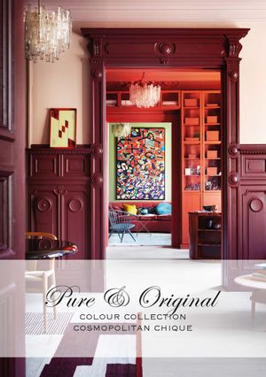
But in addition to these neutral tones, we have more! This year we launch our new “Colour Collection – Cosmopolitan Chique”, a selection of colours that complement each other beautifully and create a special atmosphere.
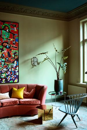
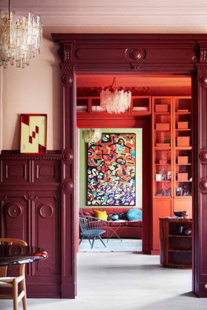
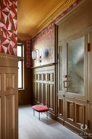
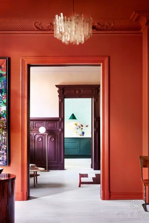
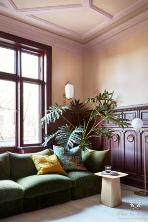
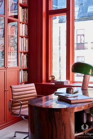
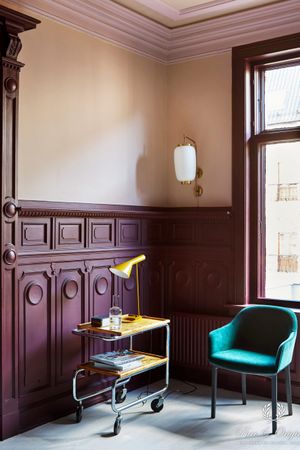
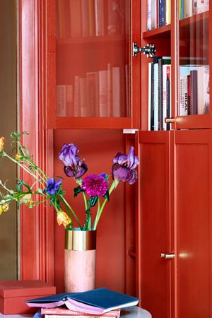
With this collection, we have chosen to focus on colour – an abundance of full, rich colours! We offer a variation of soft pink with a velvety, soft appearance, a deep purple full of force, a stunning mirror-red, and a whole range of blues from cool and crisp to warm and majestic. The colours are soft, deep, full and intense, getting the most from the natural pigments that are used. You will lose yourself in the colours, and the walls around you will feel like a soft, warm blanket… just a little more vibrant!
In order to present our “Colour Collection – Cosmopolitan Chique” best, Pure & Original has worked together with a creative team in Norway.
“Looking at the future, and how much colour we’re going to see, it’s a logical step for us to focus on applying more bright colours. We have used the already-existing colour pallette as a foundation for our new Inspiration Collection, but have enhanced our colours in a whole new setting, making them into a real statement! The variety of colour tones complements each other very well. This is a collection that demonstates that serenity and unity can be achieved with vibrant colours, as well as neutrals.”
Skin Powder Old Rose Brown Red Old Wine Praline Ocre Landscape Belgian Wilderness Black Hills Steel Blue Polar Blue
Dare with colour
The future of colour is bright! We’re heading towards the most colourful era in decades, and I absolutely love the freedom and “break all rules” attitude that’s increasing in popularity. Old neutrals will eventually be replaced by green, blue and brown, and we’ll be seeing a more playful, complex and elegant approach to colouring our surroundings.’
Dare to bring more colour into your home
Find a resellerThe story of Dagny, colour expert
‘I have to admit that I felt like a kid in a candy shop. I’ve been using Pure & Original’s colours for a long time for various projects and the brand is one of the best in the industry when it comes to making high-quality colours that last over time. In a sense, many of them are not “one season wonders”, but they have a sense of longevity that I really appreciate. This project, where the objective was to show a new and bolder side of the Pure & Original brand, was extremely interesting and rewarding.
Pure & Original has always had an elegant quality to the brand and image material. I wanted to keep the elegant feel, but with a bit of eclecticism and bold colours. The process started with finding the right location – I knew I wanted high ceilings and interesting architectural features with big windows, not to mention the right owner. The owner is important, because I wanted the end result to stay – and to match the person living there. Thankfully, we found a perfect match – the owner’s sense of aesthetics matched exactly the look we wanted to go for.

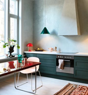
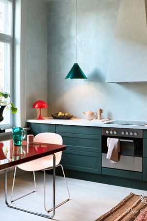
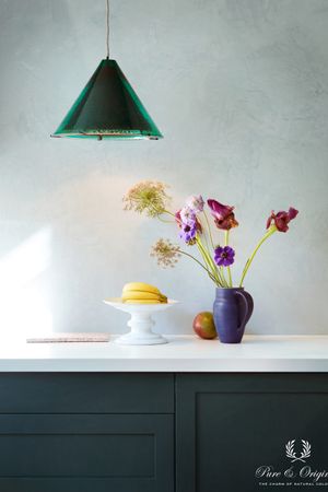
What I love about all of Pure & Original’s qualities, is the natural colour pigments. They give the colours a deeper and more intense feeling, while at the same time synthetic pigments are unable to achive that same nuance richness. We’re approaching a new colour era, that includes almost the entire colour wheel. The biggest trend is that there are no trends, personal choices and personal style will become the most attractive feature in a home. Here, I wanted to show a more complex use of colour, that inspires the customer to think outside the box, and also use colour on window frames, ceilings and not shy away from the bolder colours – if used correctly, they can also feel incredibly relaxing and calm. One of my favourite paint qualities is Classico, ultra matte, with a fabric-like kind of richness to it. The colours look so good that you want to touch them (no, not kidding, it’s really amazing). A new favourite is the Marrakech Walls quality that we used on the kitchen walls. It looks a bit like chalk paint, but it’s more like tadelakt, and has a very shiny surface. It’s such a great contrast to all the matte paint qualities, and is also incredibly touchable. My aim was to create a kind of “hug the walls” experience, and I think we succeeded in that.
It feels exactly how I pictured it in my head. I never decide on actual colours before we start, but I always have a sense of what I want it to feel like. I had some ideas of what colours to use, but I never decide 100% before I do a tour of the location and talk to the owner. Thankfully, the owner of the house loved the initial ideas and we ended up going for all of the suggestions I made in the first draft (although we did have some lengthy discussions regarding some of them, even making optional palettes). I’m very happy that Pure & Original and the owner ended up loving the campaign look and colour design.
The future of colour is bright! We’re heading towards the most colourful era in decades, and I absolutely love the freedom and “break all rules” attitude that’s increasing in popularity. Old neutrals will eventually be replaced by green, blue and brown, and we’ll be seeing a more playful, complex and elegant approach to colouring our surroundings.’
